Bad design is bad
In 2015 Moxie Marlinspike pointed out that the manual page for GPG is (now) 50% of the novel Fahrenheit 451. Any software whose man page approaches 20 thousand words better have a good excuse, and GPG can only gesture vaguely at decades of questionable design.
GPG gets a bad rap but it isn’t really much of an outlier. Security software has a long history of crumby, unintuitive interfaces and terrible design choices. A deep dive into the factors behind awfully designed security software isn’t the purpose of today’s blogpost, but suffice it to say there is seldom pressure from the end users. Security software mandated by a security team is often rammed down users’ throats, so it doesn’t bother being pleasant. It’ll sell anyway.
We’ve worked hard to buck this trend from our first version. It’s one reason why we are one of the few pieces of security software that customers actually talk about in terms of love:
 |
| https://canary.tools/love |
Recently, we released a major update to our Console. It’s been simmering for ages now, and has some really subtle flavours in the details. We figured we’d highlight a few of our favorite bits (and the thinking around them).
At the outset it’s worth knowing that we have always designed our Console to not keep our users hemmed in. While many security vendors try hard to be the “single pane of glass” commanding your daily attention, our goal is that you almost never need to login. Ideally, you’d set up your birds on day-1, and never go back until it mattered.
Learning through experience
We rely on a third party accounting tool to help manage quotes, invoices, receipts, and the rest of the financial admin that a good-looking company such our ourselves might require. A while back the accounting software vendor sent a mail announcing a major update that included significant interface changes. They announced this as “good news”, but we treated it like a bad smell:
We were happy with our accounting package. We didn’t want “big changes” in it. We wanted to build awesome software and not think about our accounting package for 10 seconds more than we had to. A bit of reflection on this experience caused us to reevaluate our new Console design. Was this how our customers would feel too? We were about to change their interactions with us. Did they need this change?
Everything is Different (not!)
The new update was built around a handful of key features. Huge amongst them was that we moved to a modern front-end framework and introduced the concept of grouping birds. The path to the final design was long and twisting. We experimented with a number of ideas to group birds (flocks!) and tried prototypes of many of them. We just couldn’t get comfortable with almost all of them.
In light of the accounting software experience, we went back to the drawing-board (several times) till we could make sure that a user who wasn’t signing up for any of the new functionality would effectively get a Console with almost no changes.
Instead, they’d be greeted with a familiar layout and just a touch of added colour. This also helped shape our transition plan (for moving customers onto the new interface) and set the boundaries for the rest of the design work.
Let’s talk specifics
With the major design considerations out the way, we want to introduce a bunch of the small touches that are impactful for users.
Cut and paste
We know that if someone is using the Console, they are probably going to be digging into incidents and passing around information. So we’ve made sure that all the fields you could need are easily copyable (and copy to a sane format). No need to highlight fiddly text and copy it just right. We take that problem away with handy Copy-actions next to each field.
The “search anything” Search
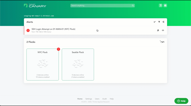
When we first built Canary, most of our users had 2-5 birds (and no Canarytokens). Now we have customers with over a 1000 Canaries and hundreds of thousands of Canarytokens. This means that our previous concept of listing Canaries (or tokens) falls away, which is why the new Console features a handy new global search box. Just start typing, and we will hone in on the bird, flock, token, alert or artefact that you want to look at.

It’s tucked away silently at the top of the screen, but once you get used to it, you will never look back.
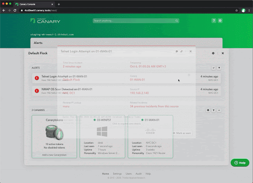
Defenders (should) think in Graphs
Canary alerts are simple, and one alert is generally enough to let you know you’ve got to cancel your plans for the weekend, but what happens if you walk into 10 of them? Viewing the alerts as a graph allows you to spot at a glance if it’s 10 attackers attacking 1 server, or 1 attacker targeting 2 machines.
We previously created “Graph View” to address this, but it was a few clicks away and was less polished. That’s now changed with our new and improved graph view.

With cleaner elements and connections (and some simple animations) the graph view is now easier to use and understand than ever before. We think it’ll be the default view for many customers, giving them a quick glance into exactly what’s happening with their birds.
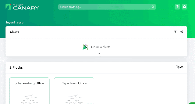
Context and Cards
Although Flocks give our users finer control over their Console, they potentially add new levels of complexity to the UI. Previously, things were simple. You would click on a bird to see its settings, or click on an alert to view its details. There wasn’t any additional context to hold.

This changes when you group birds into Flocks. From a UX perspective, the additional context raises thorny issues. For example, if the New York flock is currently active on screen and an alert arrives from a bird in the Mumbai flock, should it be displayed and, if so, where? How do we view settings that apply only to the Cape Town Flock? Keeping that context clear has the potential to add an unpleasant cognitive load on the user.
If we simply used modals at each step, a user would very quickly get lost (and likely frustrated) in a deck of multiple open modals. We want to give our users these new features, but we don’t want to complicate the UX.
In order to handle these context switches (from global views to drilling down into a specific Flock and beyond) we use a combination of cards and transitions. Cards here are, essentially, panels which take over the current visual context without anything behind them (ala modals). The cards allow us to encapsulate the current context (where the user is). The transitions allow us to flow into this new context logically, and allows the user to intuitively understand the change.
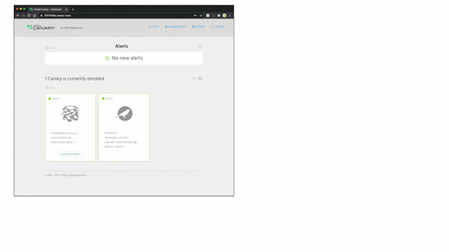
Let’s look at clicking on a Flock:
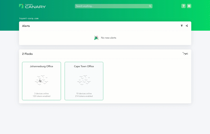
The clicked flock card slowly transitions from being in a list to now becoming the focal point. The user’s view narrows from the global context, to the Johannesburg Office flock. The card encapsulates the new context and the transition allows the user to mentally follow the switch. No other content is visible behind the card, so the user knows this in only one place. Multiple cards cannot be open at the same time.
A user clicking on the “Johannesburg Office” flock sees a transition. The flock moves from one of the listed flocks to grabbing focus and then expands to capture all of the user’s attention. It then dominates their view and becomes their new context.
It was important for us to get this right. We added new features and complexity, but we didn’t want the user to have to pay for it. We needed to put in the effort and take the complexity away from the user.
Animations aren’t for everyone
Natural animations play a big part in guiding the users’ understanding of their context in the Console. Clicking on a Flock expands its card to fill the screen, since it’s now the focus of your attention. Want to edit the Flock’s settings? Flip the card around. But it’s possible that once you’ve gotten used to them, you no longer need the animations to give you context. So we’ve taken the unusual step of letting you turn off animations with a toggle. (Yeah, we like them and think they make the app better, but we aren’t going to force them onto a user that sees no use for them.)
Inyoni
Along with the new look, we’ve introduced Inyoni. Inyoni, which means bird in Zulu (one of South Africa’s 11 official languages), may be seen hopping around the login form or periodically popping in.

Inyoni isn’t completely gratuitous and isn’t just about making a cute mascot. He also fills a real need. There are times when you could be on a section of the site where you won’t notice an alert come in. Canaries throw such few alerts, it would be a shame to miss one! So if you are scrolled away from your alert list at the top of the page (and only if you are scrolled away from your alert list), then you will hear a pleasing pop and Inyoni will politely nudge in to let you know that there’s something for you to check out.

Animated fav icon
Similar to the Inyoni pop, If a user is busy on another tab and a new alert comes in, we add a small animation to the fav icon. It’s relatively inconspicuous, but adds a heads-up that might be useful. (This is a little trickier than it looks, not all browsers support animated gifs in the favicon).

Artwork
Not being satisfied with only creating Inyoni and the favicon animation, Max helped us spruce up our artwork for this release as well. Instead of stock icons, we now use custom artwork he’s painstakingly created. You’ll find these amazing sketches in the Console:

Domain name slide
With all of our practical features, we have to confess that this one was added purely because we love how it looks! When a customer logs in, they see their domain name in the top left corner. Instead of it scrolling off the page as you scroll down, it now gradually decreases in size until it tucks up neatly under our logo (which also gently gets nudged up to make space for the text). It’s a little thing, and will likely be missed by most users, but it makes a bunch of us happy every time we see it.
Email Interactions
We are strong believers that design isn’t just about how things look, but about how they actually work. We make sure that even our emails to customers try to make things easier. When we send an alert email, the email includes actions that the user can take immediately at the bottom of the mail. (The user can choose to acknowledge the incident or add the source IP to the ignore list, for example.) Now most users might not even notice, but we do a bit more work on the back-end, so a user clicking one of these buttons doesn’t actually need to login.
This removes a few clicks for users, but it makes us incredibly happy knowing we’ve saved them a few clicks.
We do the same thing with our weekly Console round-up. Every mail includes an unsubscribe link that won’t try to guilt you to stay, and won’t ask for you to explain why you no longer want to receive emails. Click the link, good bye!
Integrations
Our view on integrations is that security vendors over-index on 3rd party integrations. “What products do you integrate with?” is a pretty standard sales question so it’s become the norm to tick as many of these boxes as possible.
This often adds unneeded complexity to the product and just as often, does so without adding extra value. We pride ourselves on a simple product with high fidelity alerts, so we’ve largely avoided this.
With the new Console, we’ve also included our first 3rd-party integration: Rumble, an ultra-light and quick network discovery tool. We’ve made sure that the integration is light-weight too, and customers who don’t use Rumble (or specifically turn the integration off) won’t ever notice it. Those who do, will be able to quickly query Rumble for more information on IPs seen in Canary.
Again, this integration “just works”. If you are logged into Rumble, we’ll automatically detect it, and will present you with a lookup link. If you aren’t, you’ll never be bothered by it at all.
Conclusion
We work hard to delight our customers. Whether it’s through support interactions, our birds, or, in this case, small UI changes that may well go unnoticed. We love them!
Security tools don’t need to suck. Sucking less actually means that users are more likely to actually use them to their full potential, and in the case of security tools, this is better for us all.
______
¹ With apologies to Rands
1 comments On Small things done well¹
This comment has been removed by a blog administrator.