We’ve written before about the effort we put into UX choices in our app. We don’t consider problems solved just because we kicked out a feature in its general vicinity and we are super strong believers in “small things done well”
This came to the fore again recently when we included a “seasonal theme” into customer Consoles and I figured it was worth a brief post to examine our thinking around (even) short-term UX.
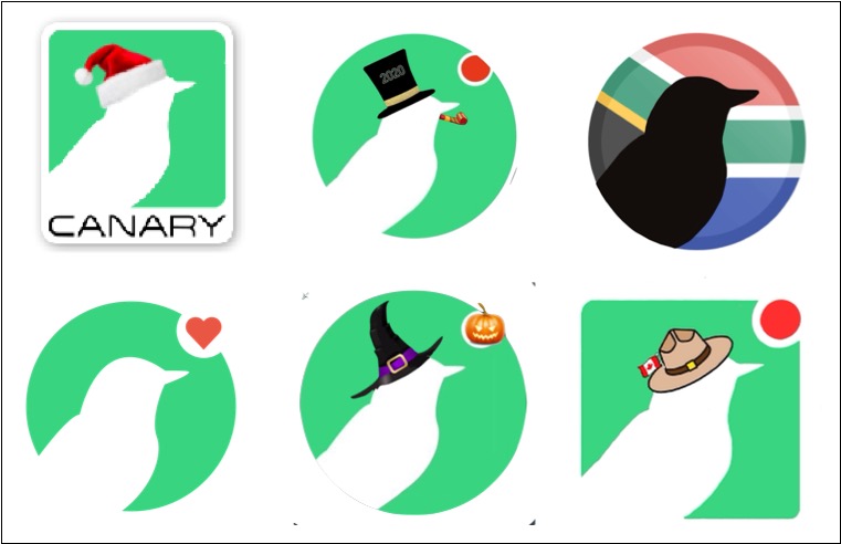
In our early days we’d give a brief nod to seasonal changes by slightly altering our Twitter avatar.
Having an actual legit designer on the team gives us significantly more leeway, and so “Console Seasonal Themes” was born. The plan is to (very infrequently) add small non-obtrusive splashes within the customer Console when a reasonable opportunity arises. These splashes should be subtle and hopefully bring a quick smile to someone’s face as they go about their day.
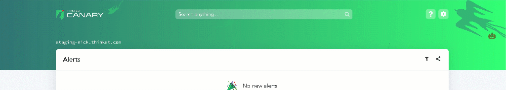
Halloween was the first opportunity to take it for a spin, and Blake threw up a few concepts. We wanted to make sure that the theme never came close to interfering with anyones workflows so ended up with two main areas to decorate: the Console header, and the Canary logo. He chose to animate ghostly birds in the header, and the logo got an appropriately spooky makeover.

It was beautiful but before unleashing it on all customer Consoles, Nick felt strongly that we should also include a button to disable the animation/effect.
We know how some customers prefer to even disable minor window animations in the UI so it was the right call. I was originally ok with simply feature-flagging the effect, which would allow the CS/support teams to disable it if a user complained, but Nick correctly pointed out that this was making the customer do too much to switch off something they never asked for.
So he added a toggle under settings to disable the animation:
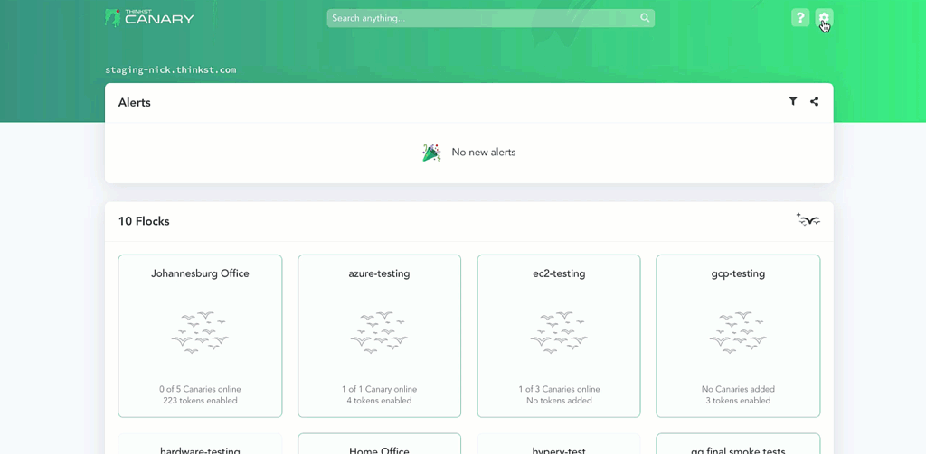
This seems like a reasonable place to ship it, but there is still a flaw: how does a user who signs in know that the animation can be turned off in settings? If they don’t know the toggle is there, it might as well not be.
So the team next tried adding a small unobtrusive button on the actual header.
The generic ℹ️ button looked like a candidate for replacement. We went through a few quick variations and settled on a relatable jack-o’-lantern:
The button that only shows up as you approach the click-zone is a pattern we use elsewhere in the app to keep the interface clean while offering needed functionality but once more the problem would be: how does a user know they should go there to float up the button?
Instead of ever making the button completely disappear, we opted to use colour and a slight wiggle to bring the user’s eye to it:
At this point, one would be tempted once more to ship it, but if we are being completely honest, the current jack-o’-button, even with its little wiggle could slip by as part of the animation. It isn’t immediately obvious (unless you’ve spent as much time as we have looking at it) that the lantern is actually a button.
So what we wanted was a button that didn’t look like a button but that people would know was a button, and we wanted it to be well hidden enough but not too much. These kinds of seemingly opposing constraints aren’t atypical in UX. Folks can think in terms of trade-offs or middle-ground, but with enough effort, we usually end up with a better result than just meeting-in-the-middle.
The final form then was wiggling, colour-changing-jack, but with a quick flash when the page loads to let you know that something was under there. It didn’t matter if the text escaped too quickly, because your natural reaction would be to hover in the area (which could then activate the button).
Ultimately, it was worth it. We enjoyed making it happen and customers (at least some of them¹) found it delightful!

___
¹ 153 Consoles disabled the effect (Which is less than 10% of those it ran on). Counter-intuitively, we count that as a win too, since we gave customers that option and they clearly found the button!