Today, we’re excited to announce the launch of the revamped Canarytokens.org, our free Canarytokens service. When you visit the updated site, you’ll notice several key enhancements.
First, the user interface has undergone a significant refresh. At Thinkst, we view code as a craft, and this philosophy guided us as we meticulously rebuilt the interface piece by piece. The result is an experience that is not only more intuitive but also more enjoyable to use.
Second, we’ve expanded the management functionality of Canarytokens. Users now have greater control over the lifespan and behaviour of their Canarytokens, providing a more customisable and efficient experience.
Finally, we partnered with Doyensec to conduct a thorough security assessment of Canarytokens. They made several recommendations that we’ve incorporated, enhancing the overall security of the service.
In this post, we’ll delve into the reasoning behind the refresh, demonstrate the new features, and discuss some of the security issues identified by Doyensec and how we addressed them.
Approaching the refresh
Canarytokens.org has been live (and catching attackers) since 2015. We launched at a time when the absolute standard for UI was… Bootstrap. Can you tell?

In early 2017 we tweaked the UI design while keeping the underlying tech, resulting in this:

And that layout persisted for seven years. The major UI components were a dropdown to select the Canarytoken, two fields for entering the required data, and a scary looking red button commanding you to fill in fields. All the elements were oversized, and had a mobile-first appearance. It was rudimentary but functional.
Throughout this time we’ve invented and built dozens of new Canarytokens that have been incorporated into the site. We’re constantly on the hunt for artefacts that can be trivially deployed while yielding a high fidelity alert of badness.
In 2019, we redesigned the user interface of our commercial Canary service, learning valuable lessons along the way. These insights were front and center as we approached this redesign of Canarytokens.org. We wanted to make the UX friendlier for new users, and bring more modern design to the site. In approaching the redesign, we also resolved to rewrite the frontend in Vue and TypeScript, which is our default frontend framework.
Introducing the new interface
Today’s update reveals a completely redesigned and rewritten interface. We’ve moved away from the dropdown selection to showing a panel for each kind of Canarytoken. This makes it much easier to find a Canarytoken and, if you’re a new user, you can more easily browse the available types:

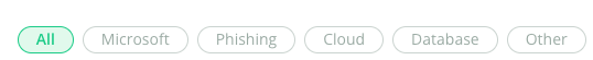
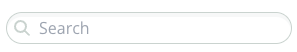
That’s a lot of panels! Luckily, the panels can be filtered, either with standard filters or via a search field:
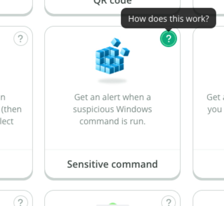
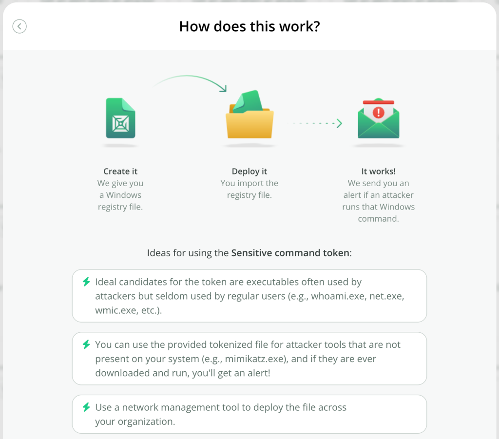
Every Canarytoken now gets an description of how the Canarytoken can be used, by clicking the help icon:
The creation step is now a separate modal, and the webhook field is an optional extra:

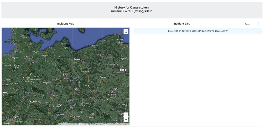
The alert history page has also been reworked, and is also mobile friendly as we expect that this page will often be accessed from mobiles when users receive alerts away from laptops:

New functionality
This cycle saw the addition of one frequently requested feature: the ability to delete a Canarytoken. If you browse to the management page for a Canarytoken, you’ll now see a Delete button:

Clicking the button will show a confirmation dialog. Confirming the Delete action will remove the Canarytoken and its alert history from our database.
On the accessibility side, we’ve added keyboard navigation and been mindful of accessibility requirements for screen readers. We’ve also kept in mind motion sensitivity, and have built-in support for users’ motion preferences.
This design and implementation was the result of several months of work by a cross-section of Thinkst, and I wanted to explore our thinking and approach specifically with regards to customer-facing changes.
Code as Craft
In our bones, we are committed to building the best products possible through software and product craftsmanship. Central to that commitment is the idea of iteration: the first design, idea, or build, will never be the final one. Sometimes, the initial attempt is obviously wrong, and we set it aside. Ideally, though, the first design forms the foundation for our new direction. This iterative approach has repeatedly proven successful for us, but it requires buy-in from the entire team, especially newcomers. Every idea is subject to scrutiny, and for new team members, it can feel like constant pushback1.
Our new Canarytokens.org design is no exception, early iterations were not fully formed. In March, Vittoria began redesigning the UX of Canarytokens.org, producing this initial sketch:

Her proposal was a marked departure from the previous UX. Instead of a minimalist page with all content visible, she suggested a full page with scrolling content. This concept became the backbone of the new design, but it needed loads of work.
We had numerous discussions debating which direction to take. The old page, with its dropdown menu, was visually simpler in its default state and uncluttered. To find a Canarytoken, users clicked the dropdown and scanned the list to find the type they wanted. This was user-friendly for regular users, allowing quick navigation and token creation.
However, Canarytokens.org is the flagship site, and many users are new to Canarytokens. The dropdown wasn’t friendly enough; it didn’t allow users to explore the available tokens. By displaying all options (like a market stall), Vittoria reasoned that users could browse and click on explanations for each Canarytoken type. This was easier and more natural, so we moved forward with iterating on this initial design.
Each iteration involves refining and improving. We created new icons, adjusted their placement, added banners, introduced transitions, modified the search function and placement, added the Creation modal, changed the history page, updated the alert email layout, and made numerous small fixes. For context, the Creation modal alone went through several iterations as we explored which icons to use and where to place them:

We fretted over spelling and capitalisation:

We debated link positions in relation to users’ fingers on the mobile devices:

We added transitions and an icon bounce animation when hovering your mouse over a Canarytoken panel:

We explored a bunch of alert email layouts:

We updated the icons:


The history page looks dramatically better due to a bunch of improvements both large (like layout), and small (consistent corner radii):

This honing process is the result of continuous collaboration among our amazing frontend developers (primarily Vittoria, with Max and Paul assisting) who build working code, and our designer (Blake) and product owner (Haroon), who test it, provide feedback, and suggest changes. Other team members (like Anna, Sara, or, occasionally, myself) also contribute observations2. We iterate until we can’t see further areas for improvement, at which point we release. In this model, there isn’t a specific deadline; the release condition is the state of the application.
Again, this approach won’t work if the team is annoyed by iterating on the same part of the application, or if there are external pressures to meet time deadlines. There’s definitely a cultural aspect to it. For example, we’ve had several snag lists (specific lists on June 26, July 3, July 4, and July 22). The alert email design alone had four separate documents. The team doesn’t run away from this, they expect to iterate going into the work.
You might ask: how is this not simply design by committee, where the result includes everybody’s suggestions yielding an anodyne atrocity? Ultimately, the product owner makes the calls. Even though input comes from multiple sources in the team, the product owner is responsible. Unapologetically, this comes down to the product owner’s taste. People shy away from saying this because it seems flighty or inegalitarian, but we believe taste matters and is an important part of the craft.
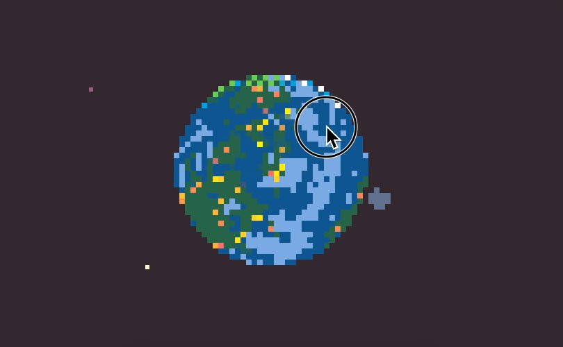
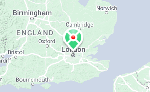
Caring about the product results in an application that includes touches like a custom marker icon on the embedded map, or an Easter egg if you try to exploit the search filter, or a custom-built 3D planetary system for the page shown when certain Canarytoken types are browsed.
There is joy in crafting, and we celebrate it.
Security assessment results
As part of this push, we engaged Doyensec3 to assess the security posture of the Canarytokens codebase, and they identified several issues. The main issue (rated Medium) was an outdated component leading to a Denial-of-Service on the web server, and was patched by updating the component. In addition, we fixed three Lows and one Informational issue they identified (a blind SSRF issue, two XSS issues, and an IAM policy issue). These are all remediated on our main Canarytokens.org site, and our Github lists advisories for these issues. If you run a self-hosted Canarytokens instance, we encourage you to update with the steps listed in the advisories.
We’re publishing the full Doyensec report (with minor details redacted). We think it’s important that projects actively assess their own security, and that the results be made public. Quoting from the report, “Overall, the security posture of the Internet-facing APIs was found to be in line with industry best practices”.
Next steps
At the heart of our product philosophy lies a dedication to craftsmanship. We pour our passion into every detail, from sweeping UX decisions to the subtle elegance of corner radius choices and the rigorous results of our security assessments. In this post, we’ve showcased several instances of our code-as-craft approach during the redesign of Canarytokens.org.
We invite you to explore the refreshed Canarytokens.org. The new layout might introduce you to Canarytokens you haven’t considered deploying before!
Footnotes
- In commercial Canary, we threw away three separate designs for the Console before landing on our current incarnation. On the one hand, that seems supremely wasteful. But Haroon was adamant we weren’t going to release a UI that was harder to use than the previous UI, and it took us until the fourth try to get it right. ↩︎
- For another example, this blog post has seen several drafts, and includes input from five team members. But I’m responsible for it. ↩︎
- Doyensec have performed several assessments on our commercial offering and we’ve been happy customers. ⭐️⭐️⭐️⭐️⭐️. ↩︎
